What color will the light be in your new painting? Will it be warm summer light or glowing indoor light? Will it be violet early or evening light? Will it be cool spring light? or brilliant winter light?
Envision your final product. What colors will you use? I have subscribed to American Art Review www.amartreview.com. I can scan the pages and bookmark the paintings that feel like my final painting. Then I analyze the hues and values to learn what colors I can use to create the light that I want.
I also use the library’s books about art. Useful internet sights are www.paintingperceptions.com, and http://art-landscape.blogspot.com.
Write down what you learn describing the colors of the light areas and the colors of the shadows. Can you identify the tube names from your studies, such as cerulean blue or cobalt blue?

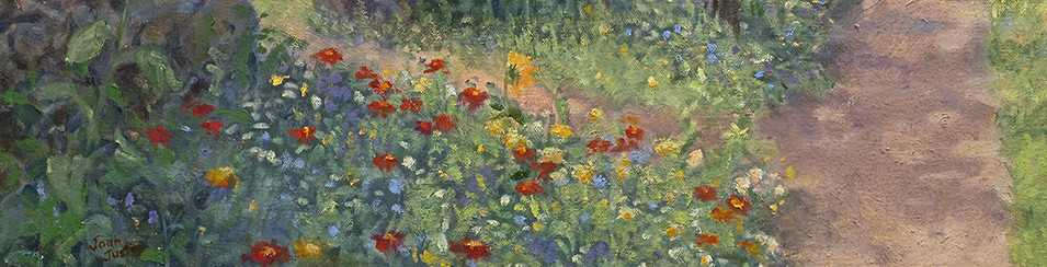
Another great resource is the Color Aid papers. www.coloraid.com My set has 314 interrelated color swatches with 34 hues, 100 tints, 47 shades, 114 pastels, 17 grays, and black and white. This painting is finished and is entitled “Ladybug”. It is on this website on the Products Page and on the Oil Paintings/Garden Oil Paintings.
I play with these color swatches and create palettes of different light effects. You will find examples at my tutorial about warm and cool colors. http://joanjustis.com/color-temperature-painting-with-warm-and-cool-colors/
Or you can try various color schemes listed in Joan’s Art Start Tutorial joanjustis.com/color-made-simple.
The next thing to do is to select three colors-a red (sometimes brown), a yellow, and a blue. Mix these colors and create warm and cool greens, violets and oranges. Mix the red and green to create blacks and add blue. Mix warm and cool browns.
Do the three colors mix to make the palette you are looking for? If not choose a different yellow, red, and blue. Label all of your mixes to remember exactly what colors you used. Keep these for future reference.

Antwerp blue, Aureolin yellow, Cadmium red medium
These three colors use a blue and yellow that are cool and lean to green. Therefore they make vibrant greens. The blue and red make a violet brown.
")
Cobalt blue, Indian yellow, Alizarin Crimson Permanent
This mixture uses Cobalt blue, Indian yellow, Alizarin Crimson Permanent. Alizarin is cool with blue in it and makes more pure violets. The yellow is warm and adds to the oranges, but the blue in the alizarin affects the orange also. (Be sure to use Alizarin crimson permanent. The old Alizarin Crimson turns black.) The green is warm with a red tone.

French ultramarine, Quinacridone rose, Cadmium yellow pale
This mixture uses French ultramarine, Cadmium yellow pale, and Quinacridone Rose. The ultramarine has red in it and makes a brilliant violet with the rose which has blue in it. The green becomes an olive green.
Did you see the possibilities for black in all three of these triads? I seldom use ivory black because it makes a visual hole in the painting. The tricolor blacks have interesting depth.
If you refrain from bringing in a lot of other colors, and use your three colors for most of your mixtures, your painting will be beautifully harmonious. Add touches of other color for accents.
Experiment until you have the palette that you envision. Do a quick study of what you want your painting to look like. Use an accent color. If this begins to feel like your image of your final product, you are ready to put the paint on your palette!

