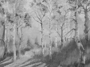
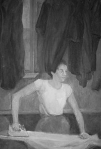
Color has value–value meaning the darkness or lightness of a color. We see the three dimensions of an object because of the shades and tints of color on that object. Color defines form with darker shadow areas and lighter highlights.
Values of color (or color tones) can also signify perspective changes. Color fades to tints in the distance. Shadows are darker in the foreground.
Each color has its own intrinsic value. Make yourself
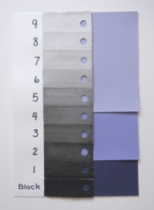
a gray scale. Use black watercolor or india ink or a pastel (leaves fingerprints when using the scale unless sprayed), and make several 1″ x 3″ swatches of various shades and tints. I measured out a strip with ten rectangular steps, (I did not put on the eleventh rectangle of white.) and masked off with masking tape the rectangle I was painting. It was difficult to get the right values. If you make a variety of black and gray swatches, you can select the ones that make a smooth transition from black to white and glue them in order. When finished, punch a hole in each step. Lay the holes over a red color. Squint and determine in which hole the red blends into the gray without making a darker or lighter dot. Which step has the same value as red? Now lay your scale over yellow. It is much higher in value.
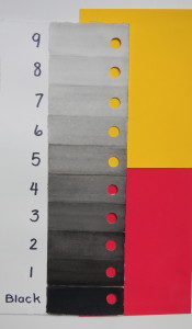
Scroll down to the black and white version of the red and yellow scale and see if you were correct.
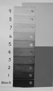
Did you choose 3 and 7?
Now try different yellows (ochre, cadmium, lemon), then blues. When I tried violet, I found that the color blended with the 1, the 4 and the 7.
The use of light colors in your painting make the overall appearance to be high key. Using dark colors keys your painting to a low value or a low key.
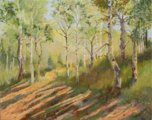
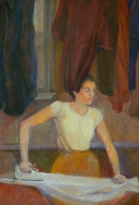
Normally you will want to use both low and high key colors, but you need to decide which one will dominate. If you use both keys randomly in the same painting, it will lose its cohesiveness and it will feel like puzzle pieces about to fly apart.
The chiaroscuro technique creates dramatic lighting by using high values to highlight a subject against deep low key colors. Chiaroscuro is a word combining the two Italian words for bright and dark. Michelangelo de Caravaggio (1571-1610) expanded the use of this style as evidenced in his paintings Supper at Emmaus 1601-02 and David with the Head of Goliath 1609-1610. He had a significant influence on Rubens, Rembrandt, and Georges de la Tour. Look at de la Tour’s The Newborn 1645 and Christ in the Carpenter’s Shop 1645.
Tenebrism, from the Latin word tenebrae meaning darkness, is often mentioned when discussing the term chiaroscuro. Art historians believe Leonardo da Vinci (1452-1519) developed this style using extreme dominance of low key values and obscure, shadowy areas.
Explore these paintings and topics on the internet. Realize the value of knowing how to key your colors!
My next blog post will discuss color temperature.

