Try these four simple color exercises. They will help you understand the myriad of color choices that you have when selecting the colors for your painting.
1) Using the color wheel in the Color Made Simple post select two complementary colors and mix a little of one into the other. Fill in a small square with the result. Continue adding another portion to the mix and record the result in an adjacent square.

This example is done in oil paint. Notice that I did it again, but this time I started with the other complement reversing the order. Did the two processes produce the same colors?

This example is done with watercolor.
As you experiment with different pairs you will find many useful grays, beautiful browns and glowing blacks. Be certain to record what colors you used and keep the samples, so that when you need a certain combination of greens or grays or blues, you can find them in your samples.
2) Make a watercolor bar graph with horizontal rows and vertical columns. List the color names across the top and down the side. Paint each horizontal row with the color named. Paint each vertical column with the same colors. Note the color changes (when you are using watercolor) where each color is glazed over by another. Which colors are opaque and which are transparent? If you watercolor, this is an excellent reference poster.

3) Make tints by adding various amounts of white to colors and mixtures. If using watercolor, add water and watch the paper reflect more and more light. I made tints of each of the colors at the end of the horizontal rows on the watercolor poster.
4) Make a variety of whites–warm and cool. Look at a paint swatch folder for ceiling whites in a paint store.
5) Collect a folder of color combinations in works of art, photographs, magazine ads, and greeting cards.

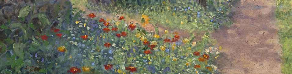
Analyze some of them to discover the original colors that make up the combinations. Does the picture use a split complementary or an analogous palette? Is high or low contrast in color and value used here? Is it a warm or cool palette? Is it low or high key? What color are the darkest darks? What color are the lightest highlights? Paint quick one hour paintings of any subject matter using some of the color palette examples in your folder.
Now you have a wealth of knowledge to use when choosing your palette for a painting. What was your favorite palette? Have you discovered some colors that work well for your color mixes?
In the next blog post you will find ways to select the palette that fits your mental image for your next work.

