Balance in a painting provides a sense of equilibrium. If an artist wants to disturb us, he can take away the balance by adding excessive weight in an area without any counterpose elsewhere. Weight is added with a dark color or large size shape or a heavy object or a shape or color that demands attention. Distant space carries weight. These can be included in a painting but with a counter balance to
create a harmonious interaction of the painting’s components.
Look at your picture plan. Imagine the fulcrum upon which your picture balances. 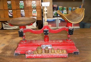 Do the two sides carry equal weight? I also like to ask myself, if I put a pin in the painting and spin it like a top would one side drag heavy? Is an area overly demanding of attention? Is there a large dark shape that weights down the picture without a counterweight on the other side of the fulcrum?
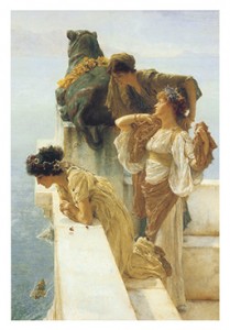
Analyze the balance of this painting.
The dark colors on this painting would make this composition top heavy, except that the stone terrace and wall appear to be very heavy in reality and easily counterbalance the weighted areas of the painting. The single woman on the left, distant sea and thick wall counterpose the two women and terrace on the right. Notice where you could put the pin or fulcrum where the vertical and horizontal lines of the wall meet. Could this be a point on the Golden Mean?
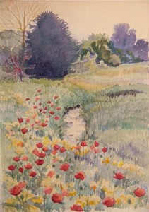
Now look at “Summer Pasture”. Notice that the large shape of grass on the right is nearly an enlarged flip of the evergreen on the left offering a counterbalance. The weight of the large poppies in the front, balance the trees on the horizon. The top of the shadow on the brook is actually the center of the picture where an imaginary pin could be placed.
Study other pieces of artwork and determine how they are balanced.
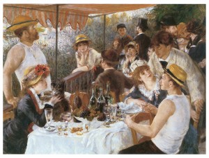
Know that the fulcrum does not have to be centered. If one end is heavy the fulcrum can be set closer to the heavy object to allow the other side to carry more weight and balance the painting. For me, the fulcrum on “Luncheon of the Boat Party 1881” (Please click on it to enlarge.) feels like it would be on the elbow of the woman in the background who is drinking from a glass. Renoir carefully planned this picture using weights and counterweights.
http://www.doverpublications.com/ .120 royalty-free paintings CD-Rom
“Everything that is beautiful is orderly and there can be no order unless things are in their right relation to each other….order stirs imagination and inspires one to reproduce this beautiful relationship existing in the universe, as best one can.” Robert Henri, The Art Spirit, p. 141, Icon Editions, Westview Press.

